
Ideation
Initial sketches focused on a few of the issues including text customisation, gamification and a search function. I applied the findings to a wireframe prototype and explored the flows.

Wireframes and flows
Features
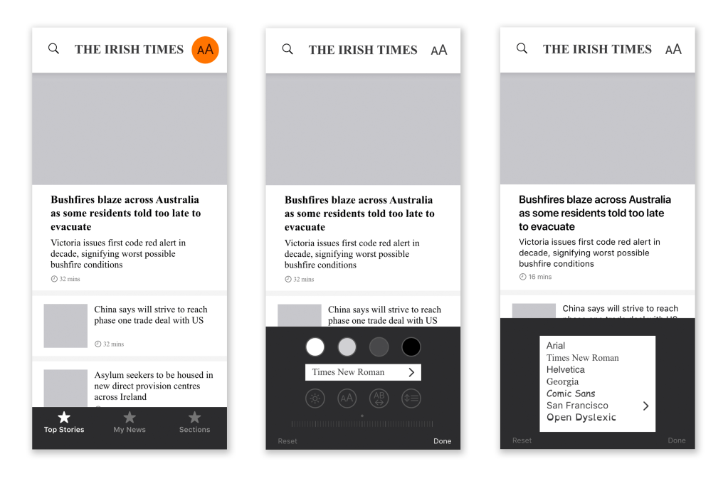
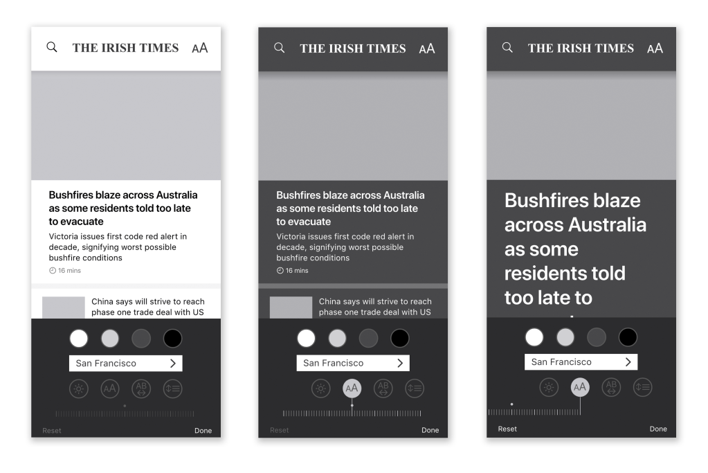


The wireframe prototype is here, which I tested with users based on my second persona. Using these findings along with assessing it against accessibility guidelines I created a hi-fidelity prototype.
Design Language
I used the Apple Human Interface Guidelines as my design system along with the UI kit with elements which are familiar, flexible and offers a high level of customisation.
Colours

Icons


Typography
The ability to select different typefaces to suit the reader is a feature of the design. I chose to focus on one in particular, San Francisco, as it is designed for maximum readability on the screen. San Francisco is a new typeface designed for optimal readability on screens at all sizes including small sizes. Featuring increased x-height and two optical sizes, the Dynamic Type format adjusts its letter and line spacing properties depending on the display unit and offers a high degree of flexibility to achieve optimal legibility at every point size.
I emailed Antonio Cavedoni, the typeface designer and Mike Stern, the UX lead at Apple looking for published findings on readability testing for San Francisco. The replies confirmed neither were aware of any such publications.


Hi-fidelity prototype
The final prototype can be viewed on a browser here and the original file is in the artefacts.
Iterations
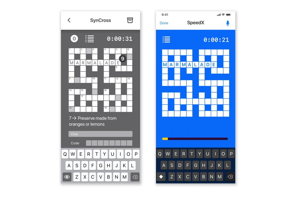
Some of the iterations from the wireframe:


Speech playback icon has been added

Features
Some of the main features of this prototype:
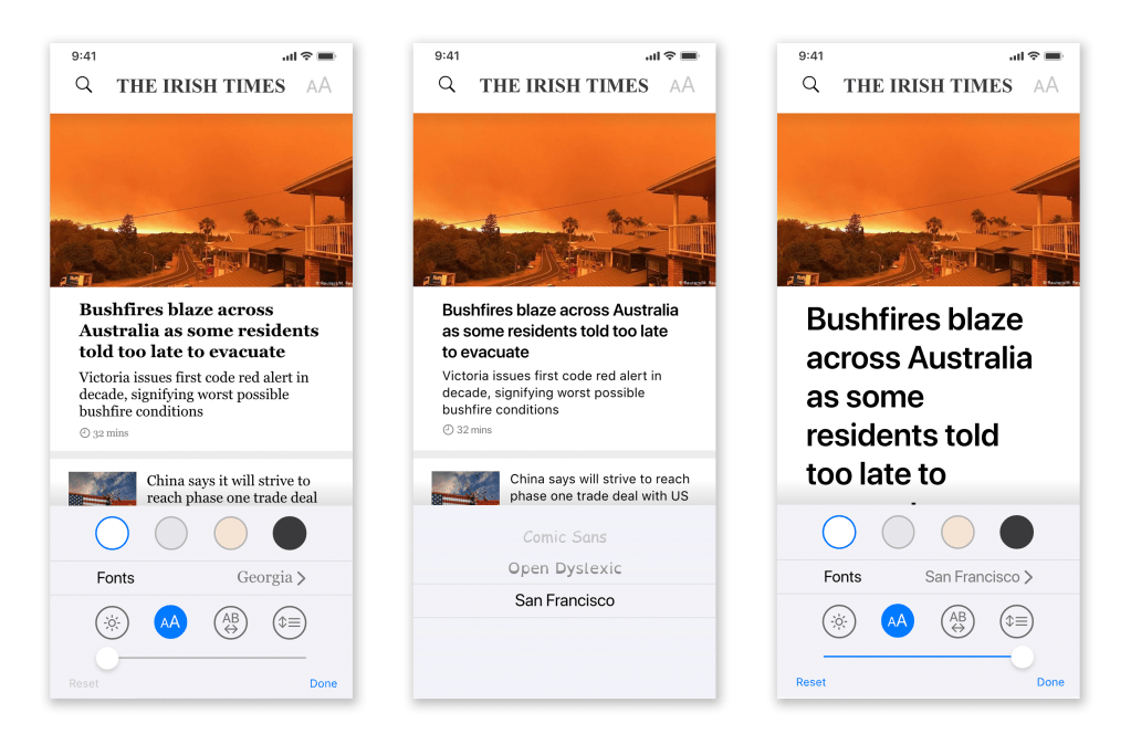


Text assisted by headings and images
In-app dictionary, synonyms and wiki


Gamification elements are simplified to include a timer, progress bar and leaderboard


